Custom Visuals with Power BI
Who Am I? What Am I Doing Here?
| Catallaxy Services |  @feaselkl |
|
 |
Curated SQL | |
 |
We Speak Linux |
Power BI
Power BI is an interactive data visualization tool. It comes with a number of built-in visualizations, including:
- Bar and stacked bar charts
- Line and area charts
- Scatterplots
- Maps, funnels, treemaps, gauges, etc.
These out-of-the-box visuals work well, but won't cover every scenario.
Expansion Points
When what comes out of the box isn't enough, Power BI also offers two major places for expansion:
- Inline display of visuals from R
- Custom visuals
Motivation
Today's talk will focus on finding and using custom Power BI visuals. Our theme of choice is baseball statistics.
Agenda
- Getting Custom Visuals
- Aquarium
- Sparkline
- Box and Whisker
- Tornado (plus Smart Filter)
- Gap Analysis
- Radar Chart
Getting Custom Visuals
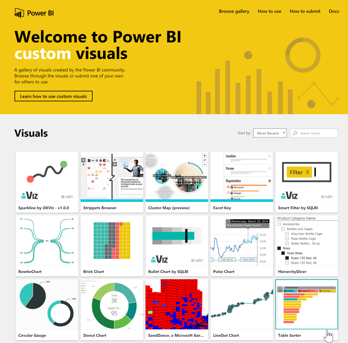
Custom visuals are available at the Power BI custom visuals gallery (https://app.powerbi.com/visuals/).
Getting Custom Visuals
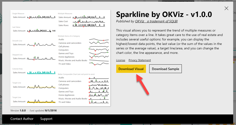
Click on an interesting-looking custom visual and you have the option to download the visual, as well as a Power BI Desktop file which shows off the visual.
Getting Custom Visuals
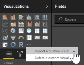
To import a visual, open Power BI Desktop and click the ellipsis (...) button on the Visualizations menu and select the "Import a custom visual" option.
Getting Custom Visuals
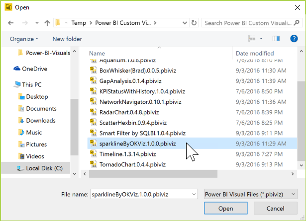
Navigate to where you downloaded the custom visual and select it.
Getting Custom Visuals
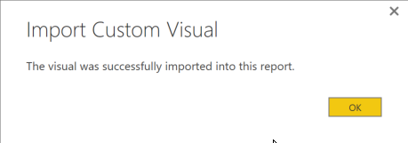
After a moment, the import should succeed.
Getting Custom Visuals
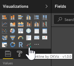
You will then see the new visual as an option on your Visualizations panel.
Agenda
- Getting Custom Visuals
- Aquarium
- Sparkline
- Box and Whisker
- Tornado (plus Smart Filter)
- Gap Analysis
- Radar Chart
Aquarium
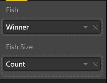
The aquarium is a toy visual, but a fun one. We select the data elements to represent fish and fish sizes.

Aquarium
Data Sources
We will use the SeriesPost.csv file from the Lahman database, calling it Championships.
Add a new measure called Count. Count = COUNTA(Championships[Winner])
Aquarium
Demo Time
Agenda
- Getting Custom Visuals
- Aquarium
- Sparkline
- Box and Whisker
- Tornado (plus Smart Filter)
- Gap Analysis
- Radar Chart
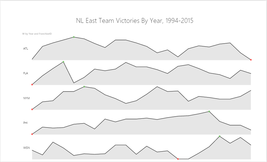
Sparkline
Sparklines are useful, terse diagrams. They are line charts without numeric values and act to show trends rather than focusing on individual data points. Sparklines are time series measures.
Sparkline
Data Sources
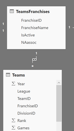
Lahman database Teams.csv and TeamsFranchises.csv files. Teams is year-by-year stats; TeamsFranchises is basic franchise information. We want to set up a data relationship in Power BI for these two files.
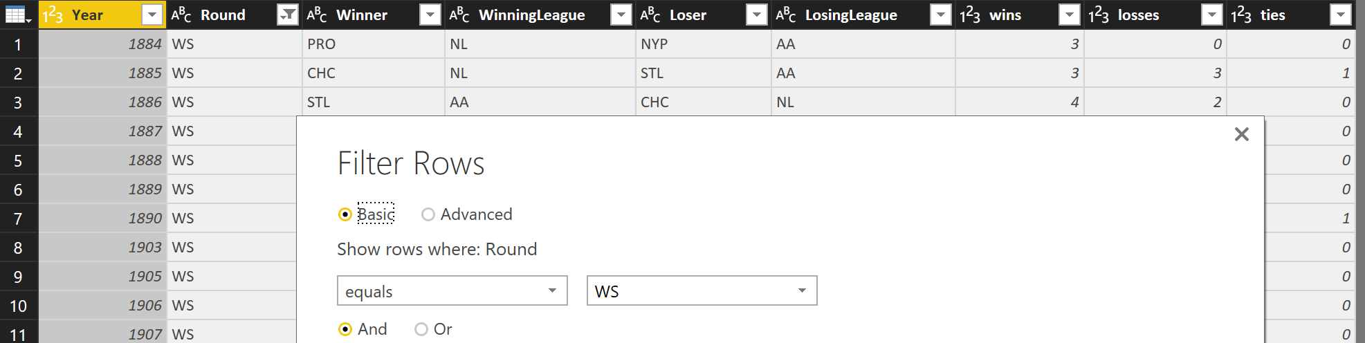
Sparkline
Filters
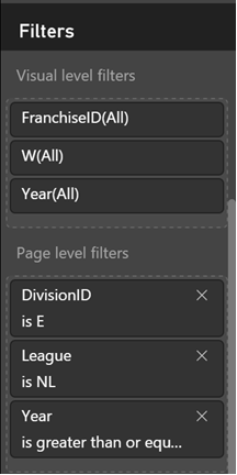
To keep from getting overwhelmed, let's look at NL East teams from 1994 on.
Sparkline
Demo Time
Agenda
- Getting Custom Visuals
- Aquarium
- Sparkline
- Box and Whisker
- Tornado (plus Smart Filter)
- Gap Analysis
- Radar Chart
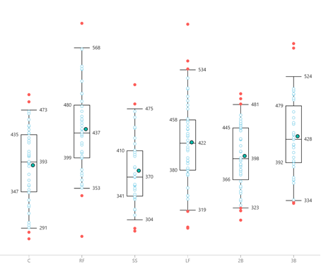
Box and Whisker
The box and whisker chart plots the distribution of elements, showing us helpful figures like median, mean, first and third quartiles, and outliers.
Box and Whisker
Data Sources
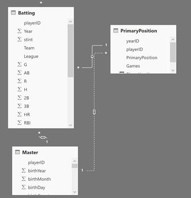
Lahman database Batting.csv and Master.csv, and locally created PlayerPositions.csv files.
Box and Whisker
Calculations
Slugging percentage is defined as Total Bases / At-Bats. Total Bases = (1 * 1B) + (2 * 2B) + (3 * 3B) + (4 * HR). We have Hits rather than singles, so our modified calculation is:
SLG = 1000.0 * (Batting[H] + Batting[2B] + 2 * Batting[3B] + 3 * Batting[HR]) / Batting[AB]
SLG is usually calculated as a range from 0 to 1 (or more); we multiply by 1000 to make it a range from 0 to 1000.
Box and Whisker
Demo Time
Agenda
- Getting Custom Visuals
- Aquarium
- Sparkline
- Box and Whisker
- Tornado (plus Smart Filter)
- Gap Analysis
- Radar Chart
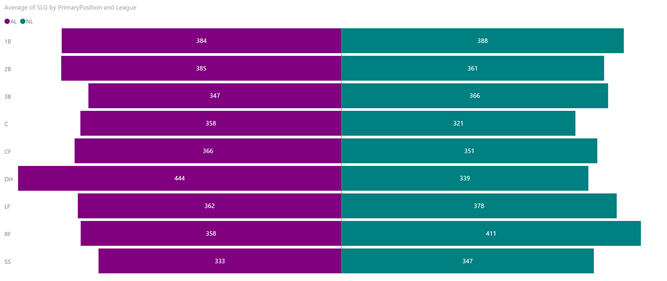
Tornado
The tornado visual shows a class-by-class breakdown of two groups. We often see this in sporting events or other direct competitions.
Tornado
Data Sources
We use the same data sources and calculations as in the Box and Whisker experiment.
Tornado
Smart Filter
Another custom visual is the Smart Filter. This is an easy way of showing filters on-screen.
Tornado
Demo Time
Agenda
- Getting Custom Visuals
- Aquarium
- Sparkline
- Box and Whisker
- Tornado (plus Smart Filter)
- Gap Analysis
- Radar Chart
Gap Analysis
The gap analysis visual gives a direct comparison between two elements. This is similar to the Tornado visual, but gap analysis focuses more on differences.
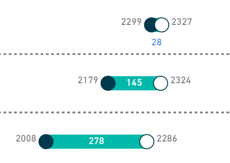
Gap Analysis
Data Sources
We use the same data sources as in the Box and Whisker and Tornado experiments. We do not need the slugging percentage calculation, however.
Gap Analysis
Demo Time
Agenda
- Getting Custom Visuals
- Aquarium
- Sparkline
- Box and Whisker
- Tornado (plus Smart Filter)
- Gap Analysis
- Radar Chart
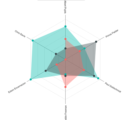
Radar Chart
Radar charts (AKA spider charts) give a 2D representation of several variables.
Radar Chart
Data Sources
We use the locally created BattingRatings.csv file. This data comes from OOTP 16.
We have one new calculation, FullName. FullName = BattingRatings[FirstName] & " " & BattingRatings[LastName]
Radar Chart
Demo Time
Wrapping Up
There are a number of custom visuals available within Power BI. You can also create your own custom visuals.
To learn more, go here: http://CSmore.info/on/powerbiviz
And for help, contact me: feasel@catallaxyservices.com | @feaselkl